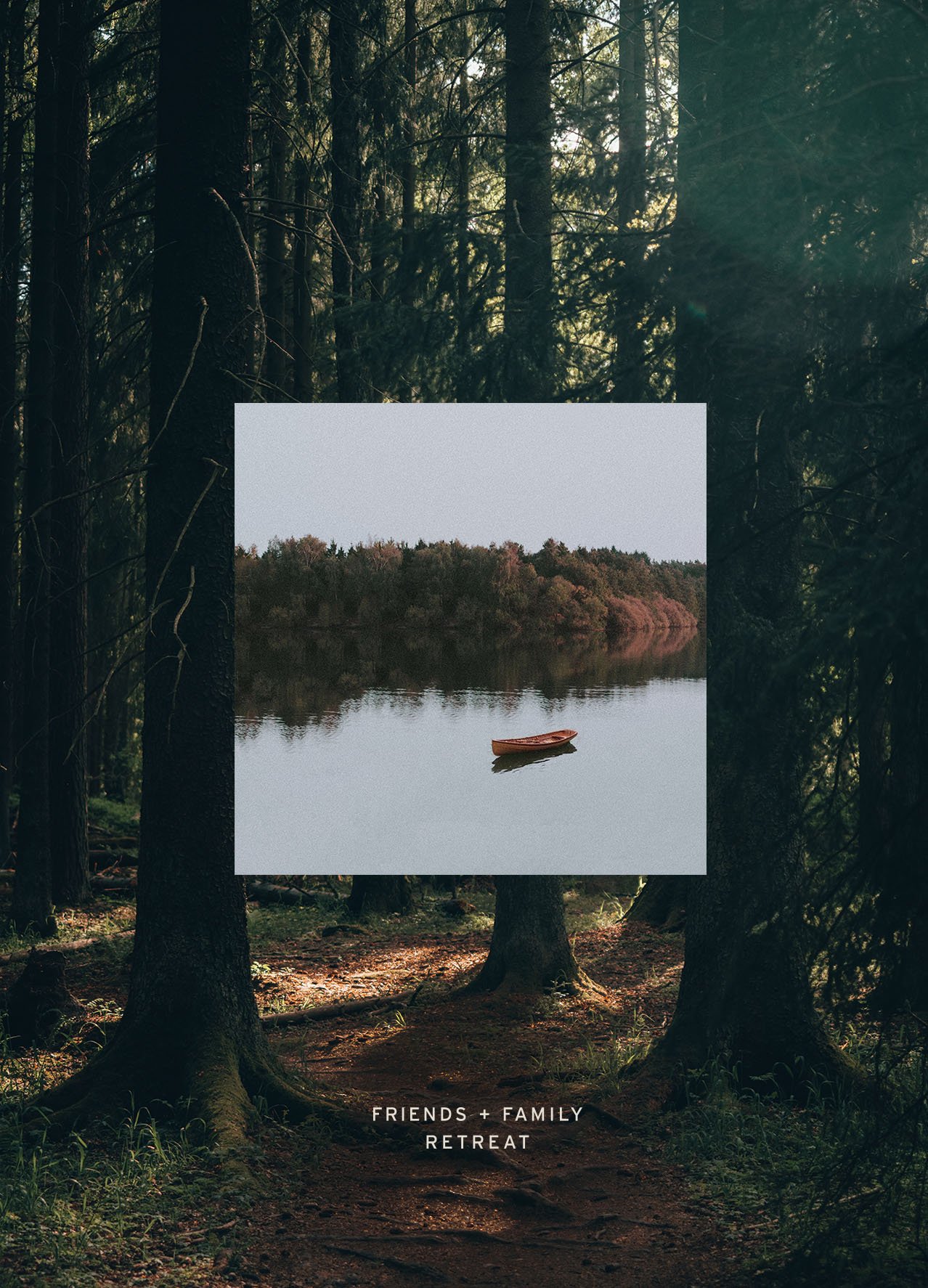
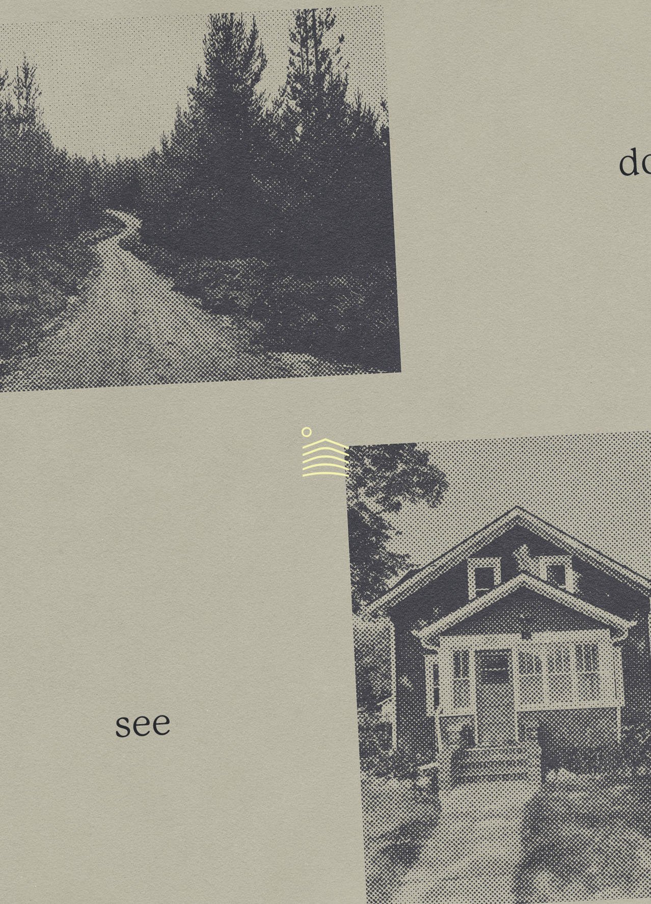
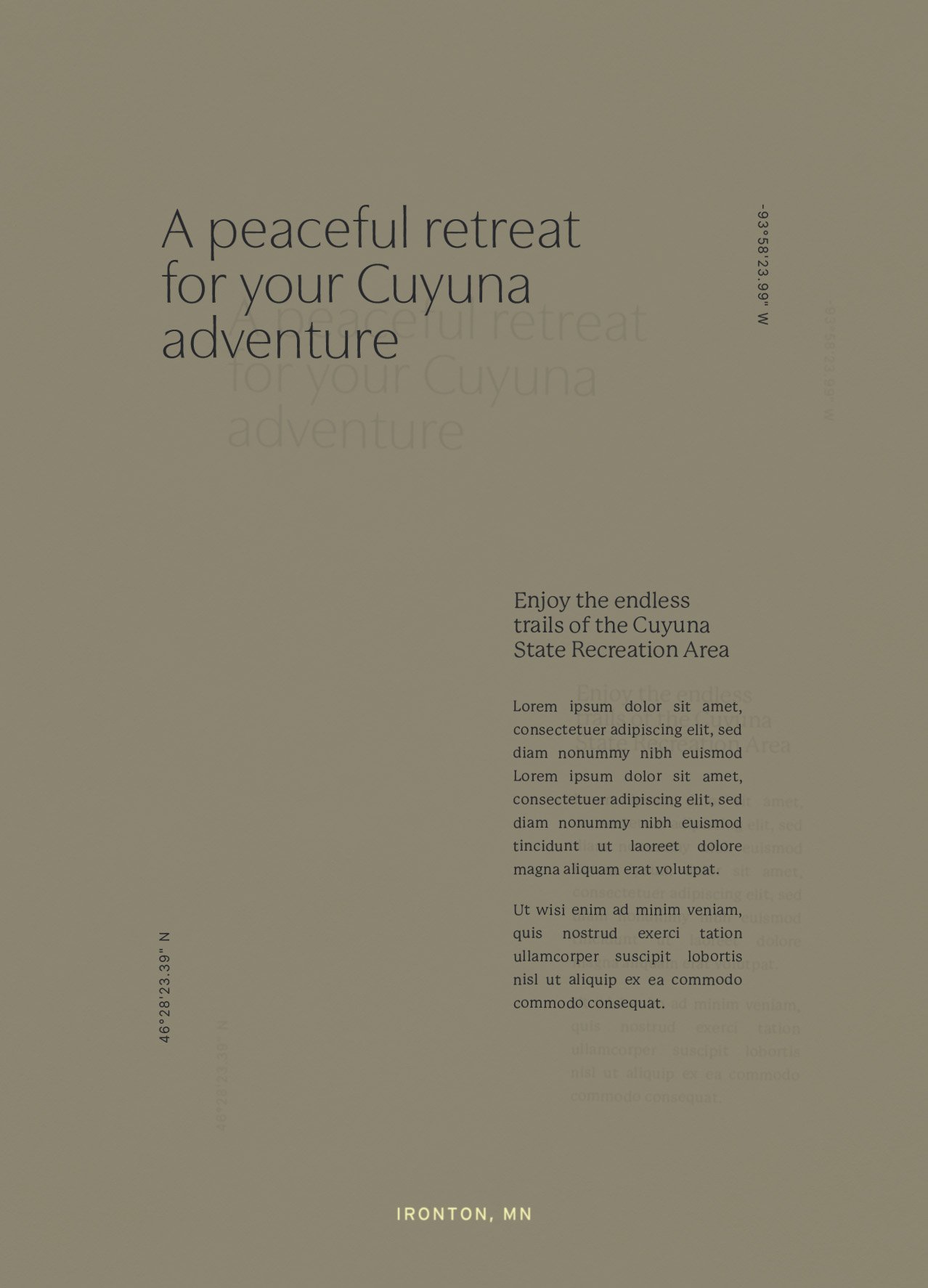
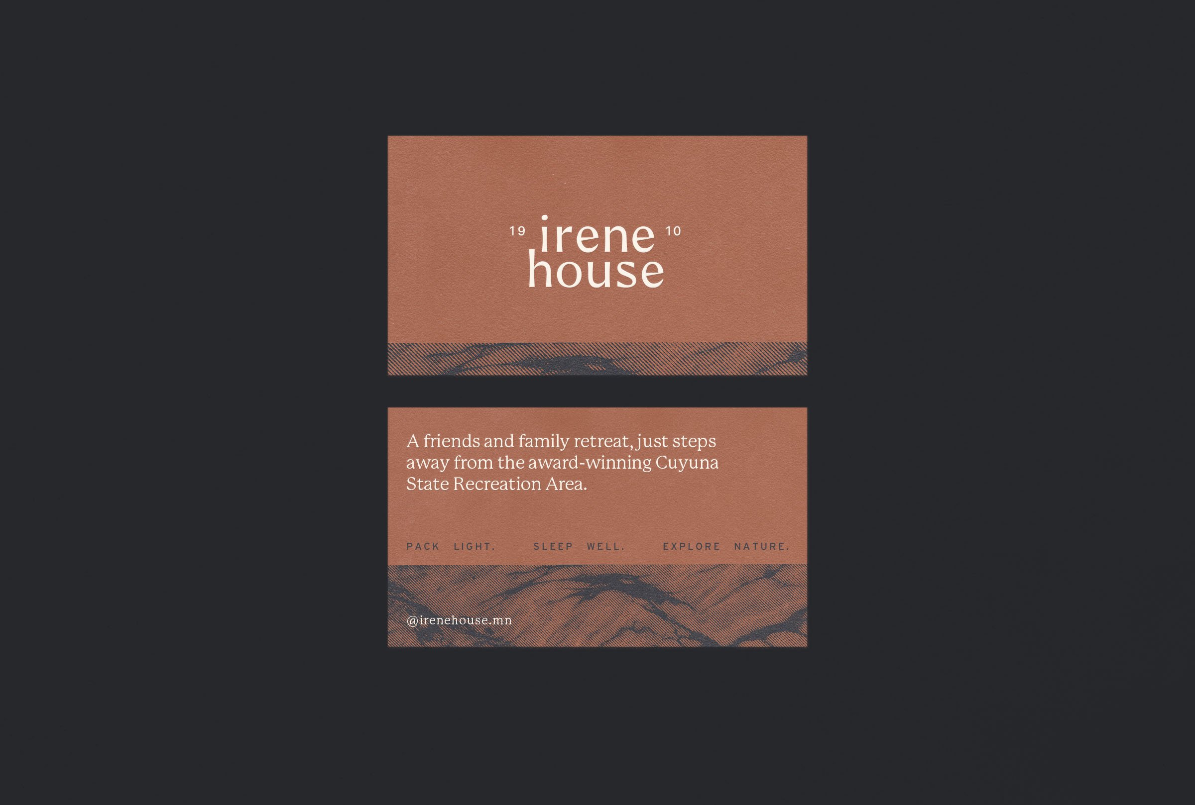
Irene House is a spacious group retreat rental in northern Minnesota. Located just steps away from the Cuyuna State Recreation Area, families and friends can comfortably stay under the same roof and enjoy the many outdoor activities the area has to offer.
Services
Brand Identity
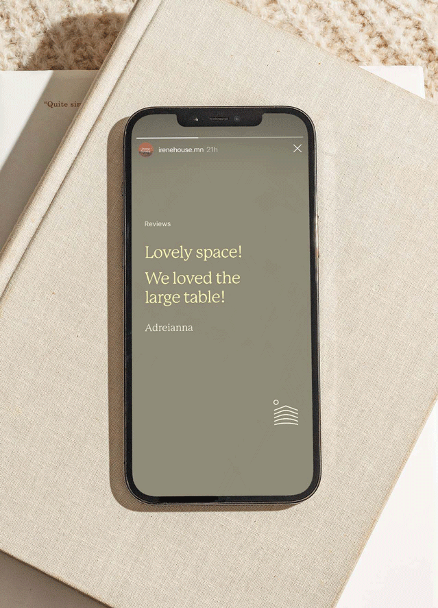
Social Media Templates
The Concept
The rich history and natural colors of the Cuyuna Range were primary inspirations for the brand identity — most notable of which are the red clay trails, dyed by the iron ore found deep below the surface.
Beyond the natural surroundings, it was also important to create a sense of calm for guests to be able to rest after a lively day of hiking, biking, or scuba diving.
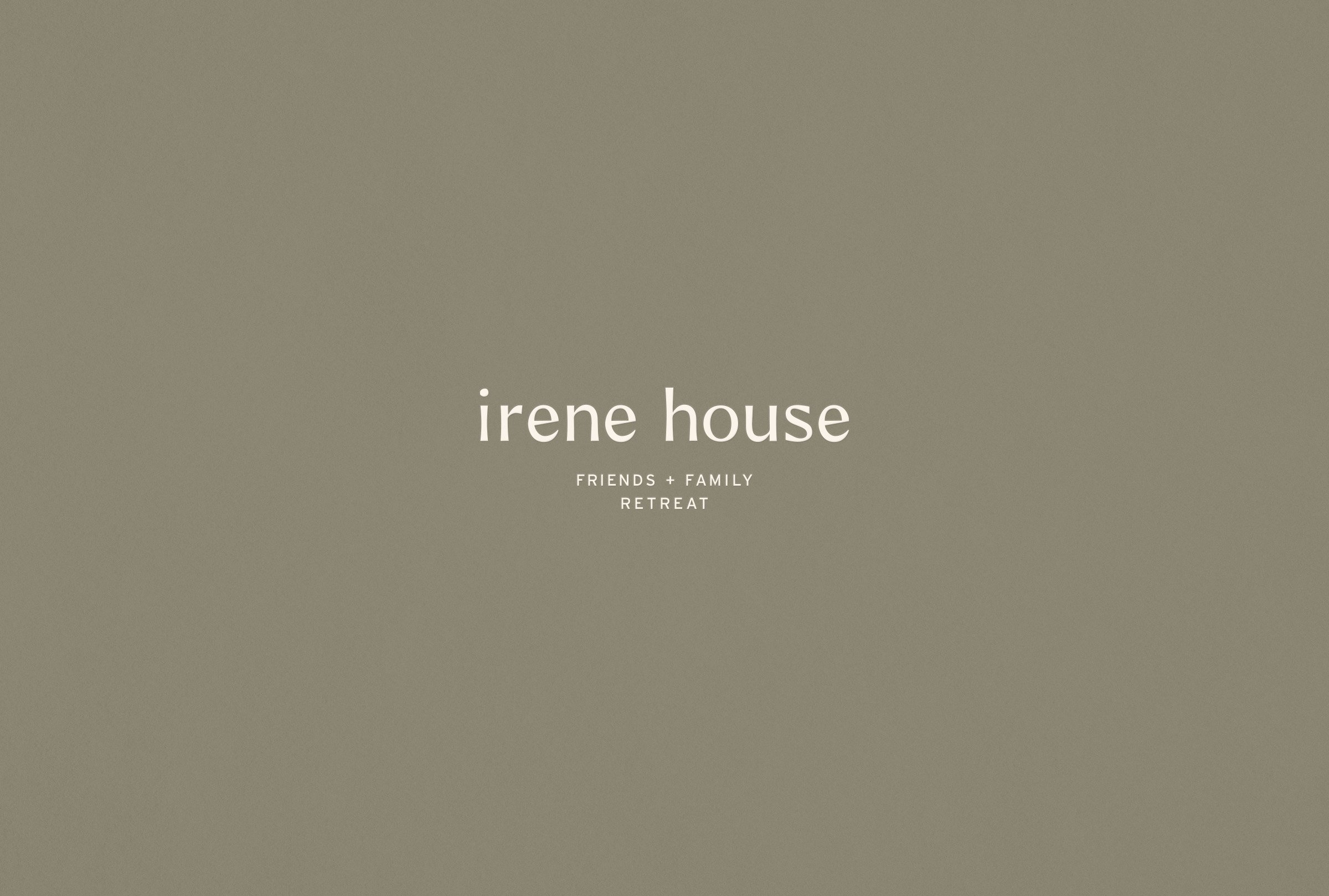
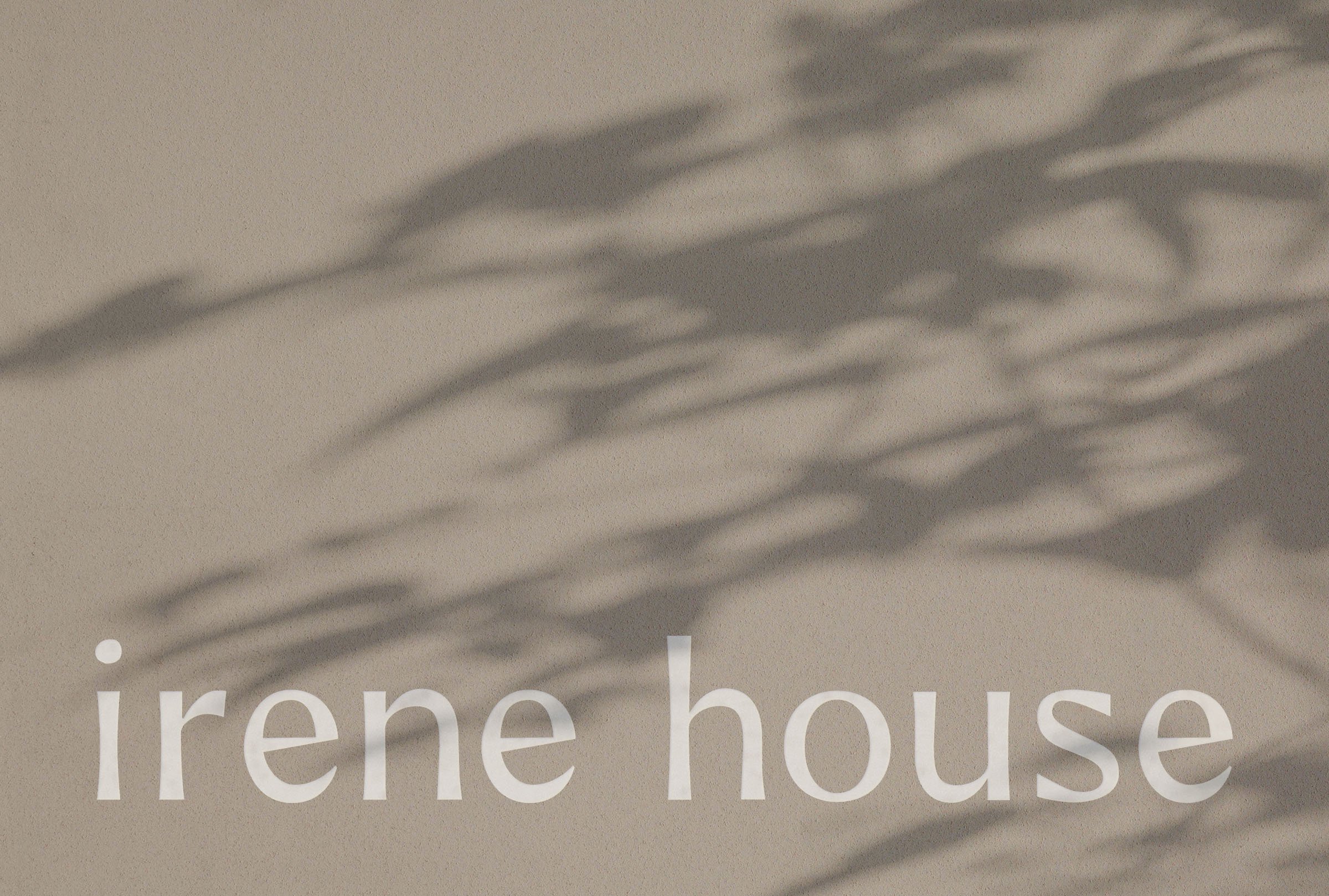
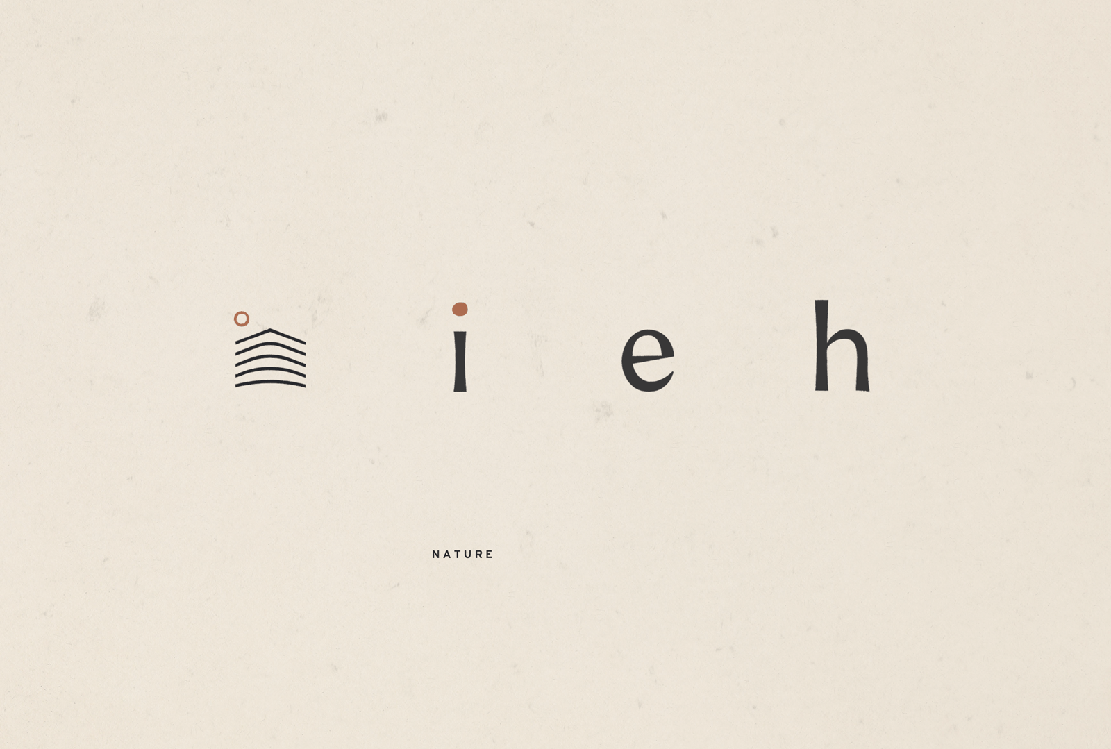
The Logo
The wordmark is set in lowercase for a relaxed, approachable, and inviting feel. The irregular dot of the “i” gives a nod to the rawness of nature while also bridging the Irene name to the sun shape found within the house mark.
Throughout the rest of the logo, we created forms that moved between an active state (sharp, angling upward) and resting state (soft, shallow curves) to mirror the guest’s experience during their stay.
“I absolutely loved working with Natalie to develop our brand identity. She’s an incredibly talented designer who is able to take a loose creative idea and not only translate, but elevate the final product to something beautiful and meaningful. She’s collaborative, super-easy to work with and makes sure you have what you need as a client to translate the work on a tactical level. I’d jump at the chance to work with her again!”
Kristan Nolan, Irene House
Next Project
